
Prepare your picture · Words that survive a smaller screen
Design a Readable Message for a Photo Jigsaw
Quick summary
For a text photo jigsaw puzzle, put the words into the image before opening the puzzle maker. Choose a short message, give its letters enough room and inspect a smaller version before playing. A line that looks comfortable on an editing canvas may become tiny on a phone.
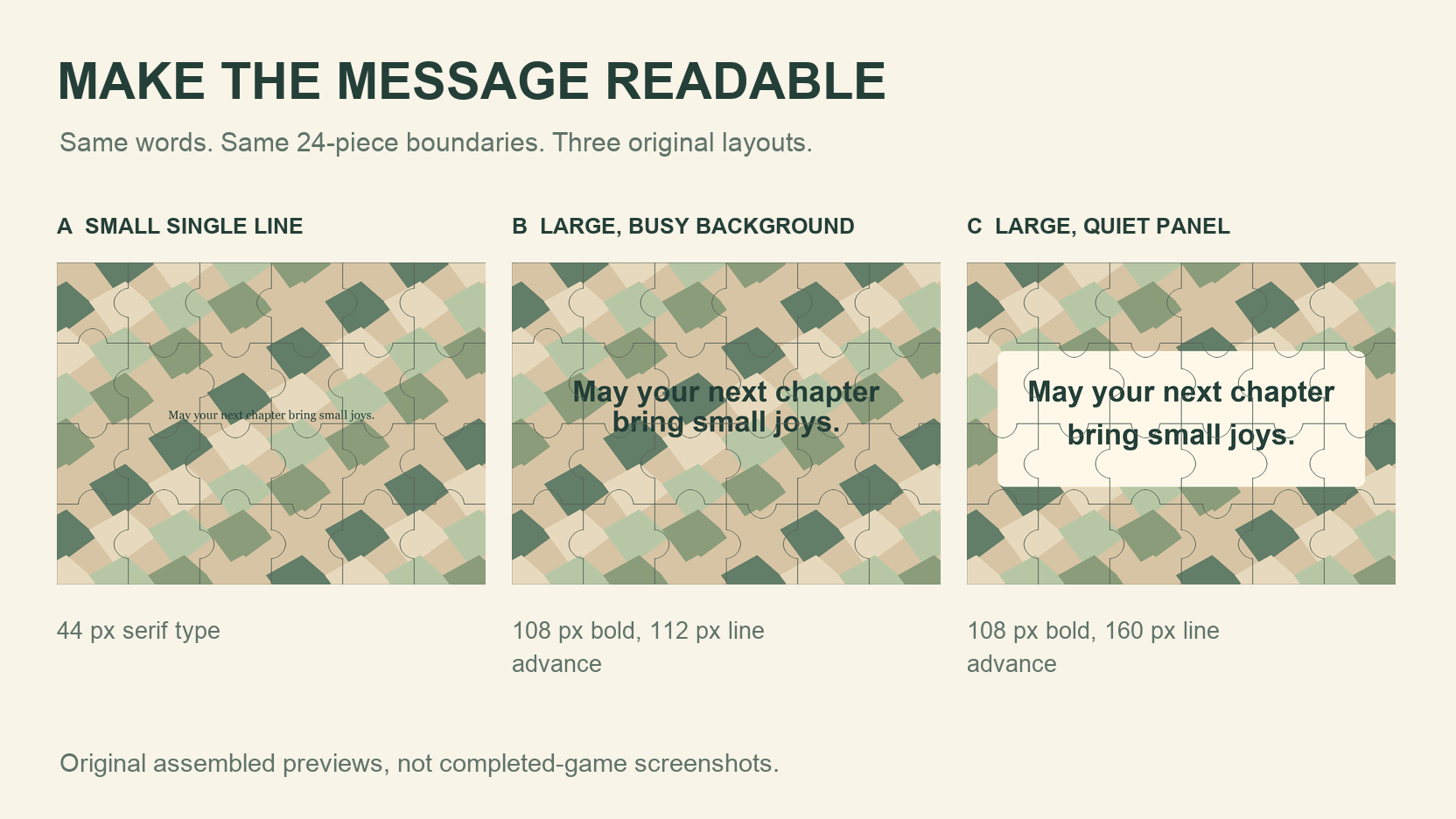
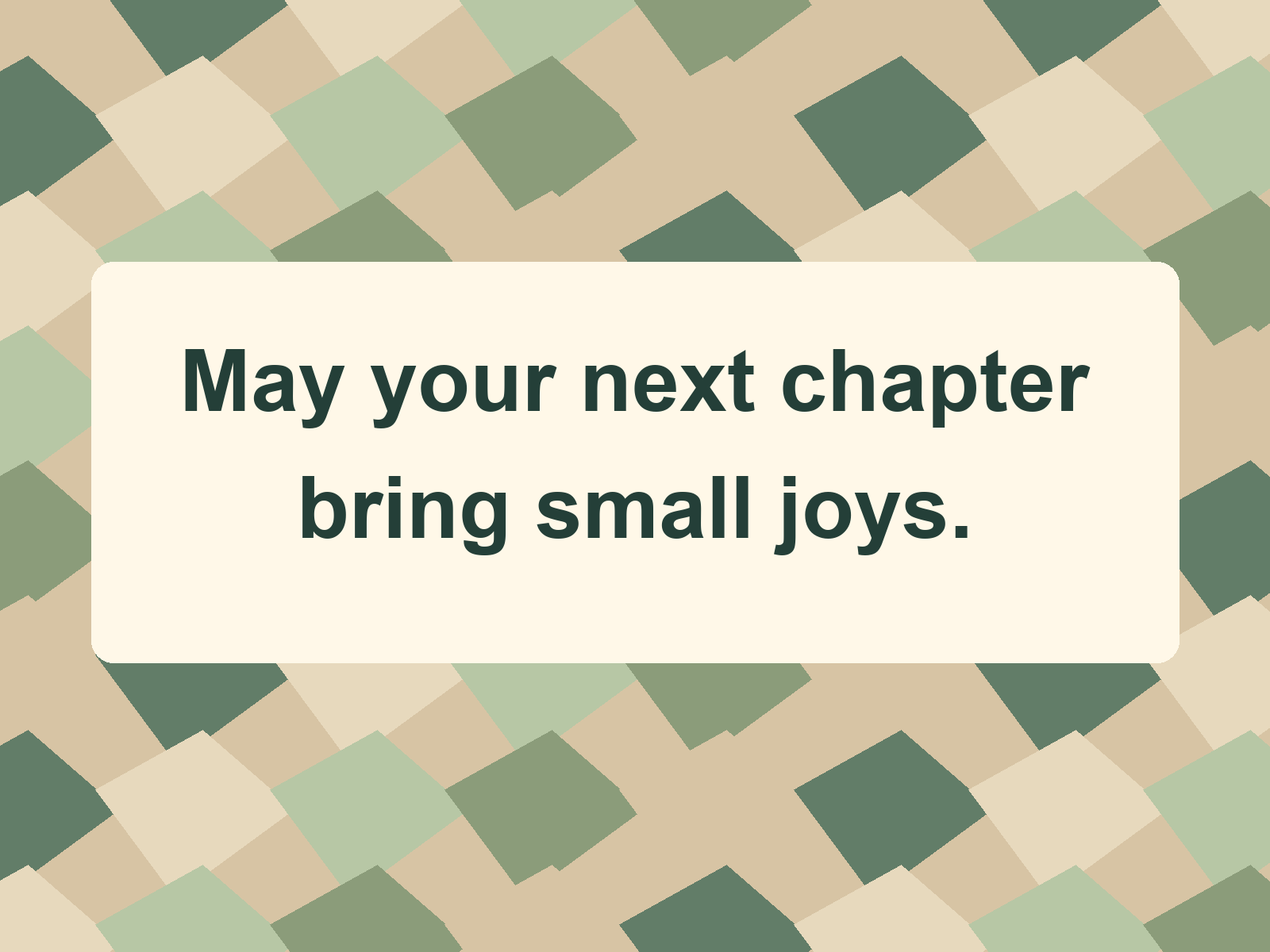
The original blessing here is May your next chapter bring small joys. We compare three layouts using identical 24-piece boundaries and provide a finished PNG. These are assembled editorial previews, not screenshots of completed games or results from a readability study.
Key takeaways
- 01Use the intended viewing size to judge the lettering.
- 02Keep busy picture details away from the words.
- 03Export the lettering as part of the image before using DIY.
Choose one short message
Our seven-word blessing expresses one thought. Read yours aloud and remove anything that needs extra context. Check the spelling before export. Once a word is part of the picture, the website cannot correct it.
Type the message in an external image editor and save the complete design as PNG or JPEG. JigsawPuzzle.pro accepts a finished image. It has no text editor, shareable secret-message system, completion-triggered message reveal or enforced answer hiding.
We checked the W3C guidance on colour and contrast while preparing the examples. The design choices below are an editorial application to a puzzle image. They do not establish that a game or a particular layout is fully accessible.
Compare three layouts on the same 24-piece frame
All three originals use a 1600 by 1200 pixel canvas, the same patterned background and the same words. The comparison overlays use the site’s piece geometry in a six-column, four-row assembled frame. A fixed seed keeps every boundary in the same place across A, B and C.
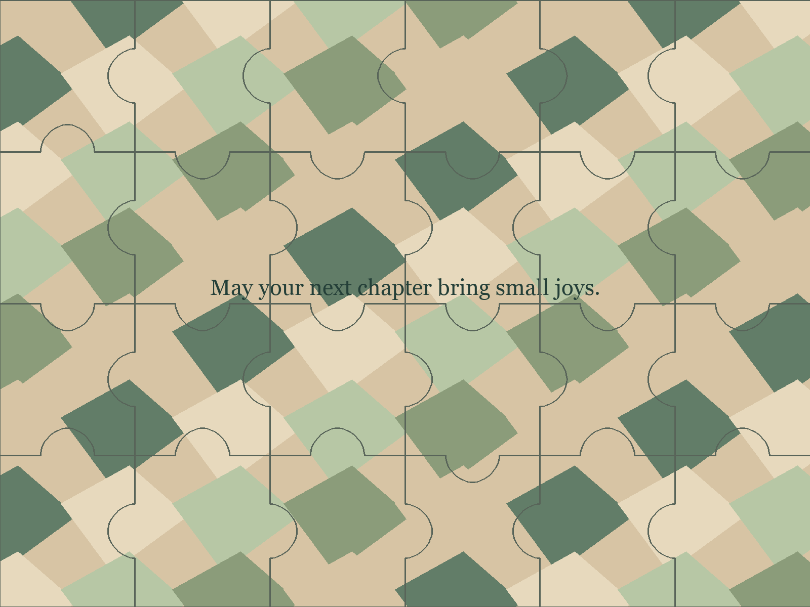
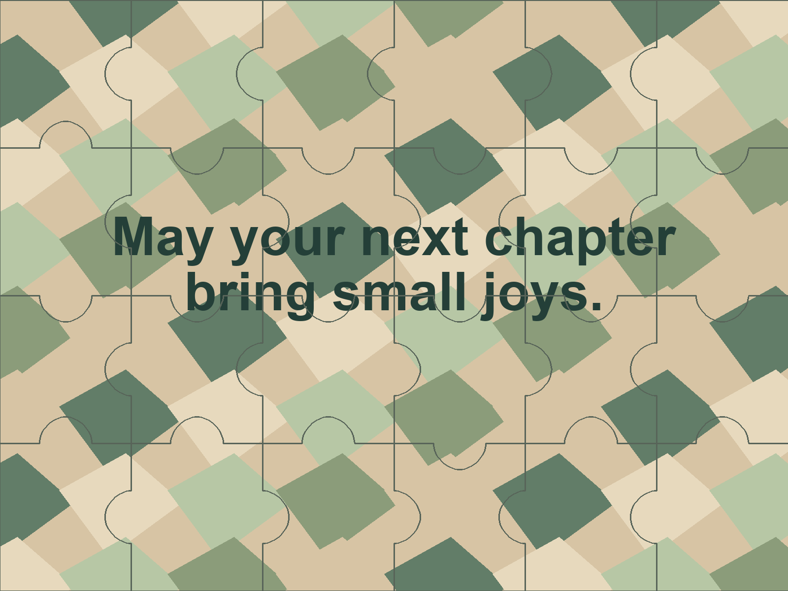
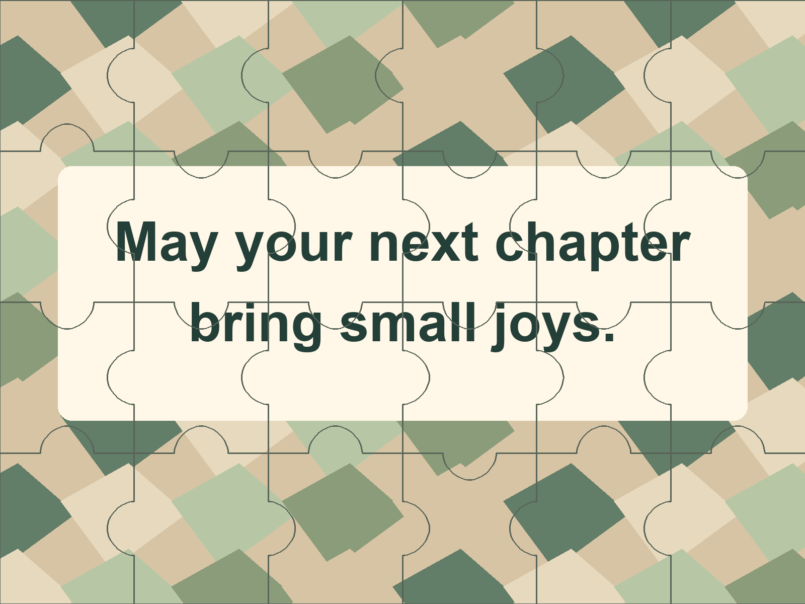
A uses one small line. B enlarges the words and splits them over two lines, leaving the pattern behind them. C adds space between lines and a solid light panel. Several choices change together here, so the comparison cannot isolate the effect of any one change.
| Layout | Source type | Lines and line advance | Background under words |
|---|---|---|---|
| A | 44 px Georgia Regular | One line | Pattern |
| B | 108 px Arial Bold | Two lines, 112 px advance | Pattern |
| C | 108 px Arial Bold | Two lines, 160 px advance | Solid light panel |
Compare type size and line length
Measure the text at the width the recipient will actually see. At a 360-pixel image width, A’s nominal 44-pixel source type scales to about 9.9 pixels. The 108-pixel source type in B and C scales to about 24.3 pixels. These are scale calculations for these files, not universal font-size rules.
Break a sentence where the thought naturally pauses. Our jigsaw text layout puts May your next chapter on the first line and bring small joys on the second. Each line retains a useful phrase. Keep enough space for letters with descending strokes, such as the y in joys.
Line advance is the distance between matching positions on successive lines. The visible gap between letters will be smaller. Check the exported picture, including punctuation, to see whether the lines feel crowded.
Keep the words clear over the background
Compare how shape, texture and lightness can distinguish two groups in the same layout.
A busy photograph or illustration can put a dark patch under one letter and a pale patch under the next. You can see that variation in B. C gives the sentence one background colour, keeping the edges of its letters more consistent.
W3C’s contrast guidance gives 4.5 to 1 for ordinary text and 3 to 1 for large text, with defined exceptions. For C, the chosen dark text and light panel have a flat-colour contrast ratio of about 10.77 to 1. That calculation does not measure the effect of seams, antialiasing or someone’s eyesight.
The separate W3C guidance on use of colour says meaning should have another cue when colour conveys information. Keep the actual blessing in words. If coloured words indicate a reading order, add numbers or another explicit cue too. Supply the message as ordinary text alongside the picture when sharing it.
Test the finished picture at a real viewing size
Try the water cycle activity for a diagram whose labels and arrowheads both need to stay readable.
Look at the export at a normal desktop size, then at a phone-sized width. Read the message without zooming. If you need to remember the sentence to decipher a letter, revise it. Ask the intended reader to check when practical.
Use the same 24-piece count when comparing your own alternatives. Review both the whole picture and a few loose fragments. A cut through a word is expected; the assembled sentence still needs to read clearly. Keep useful margins around the message so it does not sit against the image edge.
The generated previews here show a fully assembled arrangement. A live game starts with shuffled pieces and can use different cut directions. They help inspect layout, but they do not prove that anyone completed the puzzle or that a message remained concealed during play.
In a Chrome check on November 1, 2026, C opened at Medium with 24 pieces. At a 390-pixel viewport, its reference image measured 192 pixels wide, smaller than our 360-pixel comparisons. The board remained unfinished. This was a display and control check, with no human readability study.
Use the finished image in the puzzle maker
Download C without the drawn seam overlay. The puzzle maker will create its own pieces, so uploading an already outlined preview would add a second set of lines. Keep the original editable file separately if you want to change the wording later.
Download the finished message image without seams.
Open DIY and try the finished image at Medium, 24 pieces.
Use the photo puzzle guide for the image preparation workflow.
Jigsaw Explorer’s escape-room guide describes mystery-puzzle controls on its own service. This readable message puzzle image will be visible picture content on JigsawPuzzle.pro. The reference control can show the words before assembly.
Conclusion
Check the exported image at the size your recipient will use. Once the words are comfortable to read, keep that file and choose 24 pieces for the first trial.
Sources and further reading
Frequently asked questions
Next move
Try a finished message image
Prepare the lettering outside the puzzle maker, then use the combined picture.